KFH rebrand
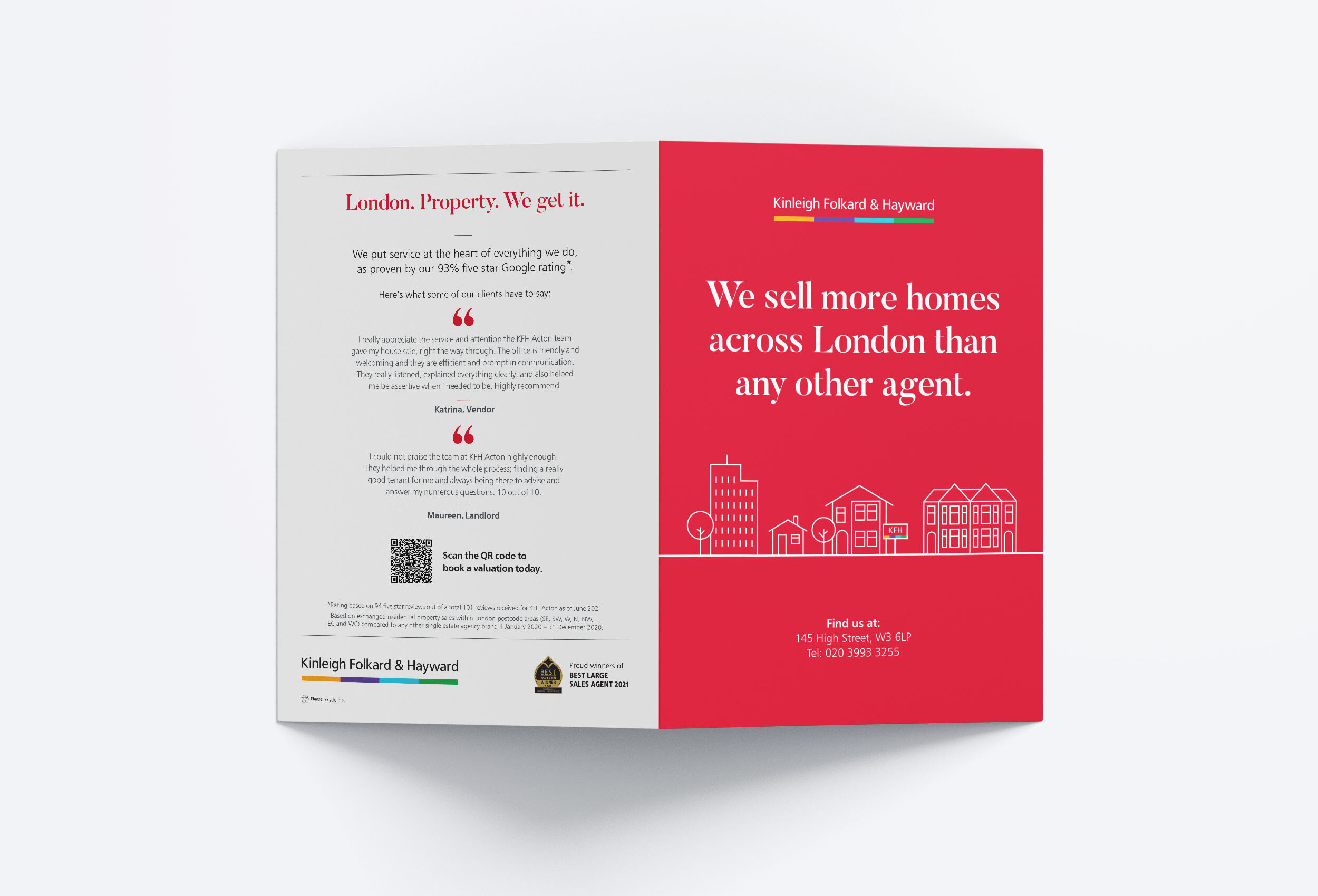
As part of the 2019 brand refresh, all print items were reconsidered. The KFH logo, colours, fonts, typography and photographic elements were updated on all digital, print, merchandise and shop fronts. I was selected for an incentive trip to Verbier as a result.
Lead Designer: Design | Typography | Art Direction | Retouch
- re-design all digital and printed brochures featuring new typography and photography
- re-design all merchandise including a new reusable water bottle
- design KFH team jersey for fundraising
- design London Youth assets for sponsorship


KFH email marketing
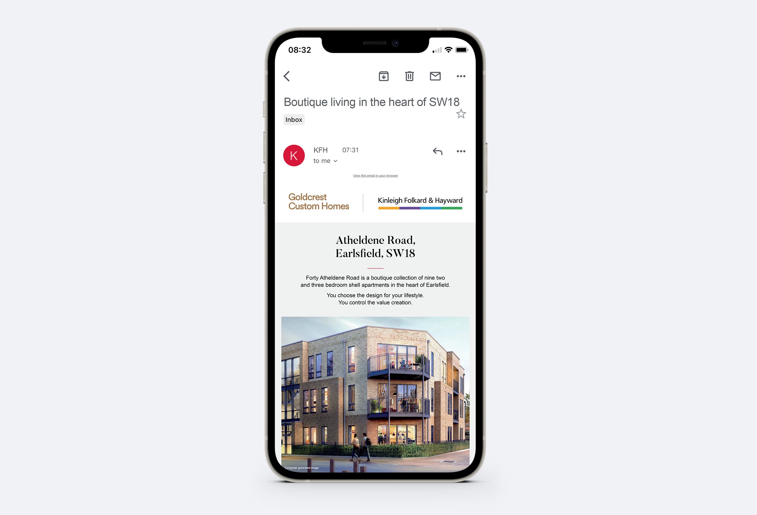
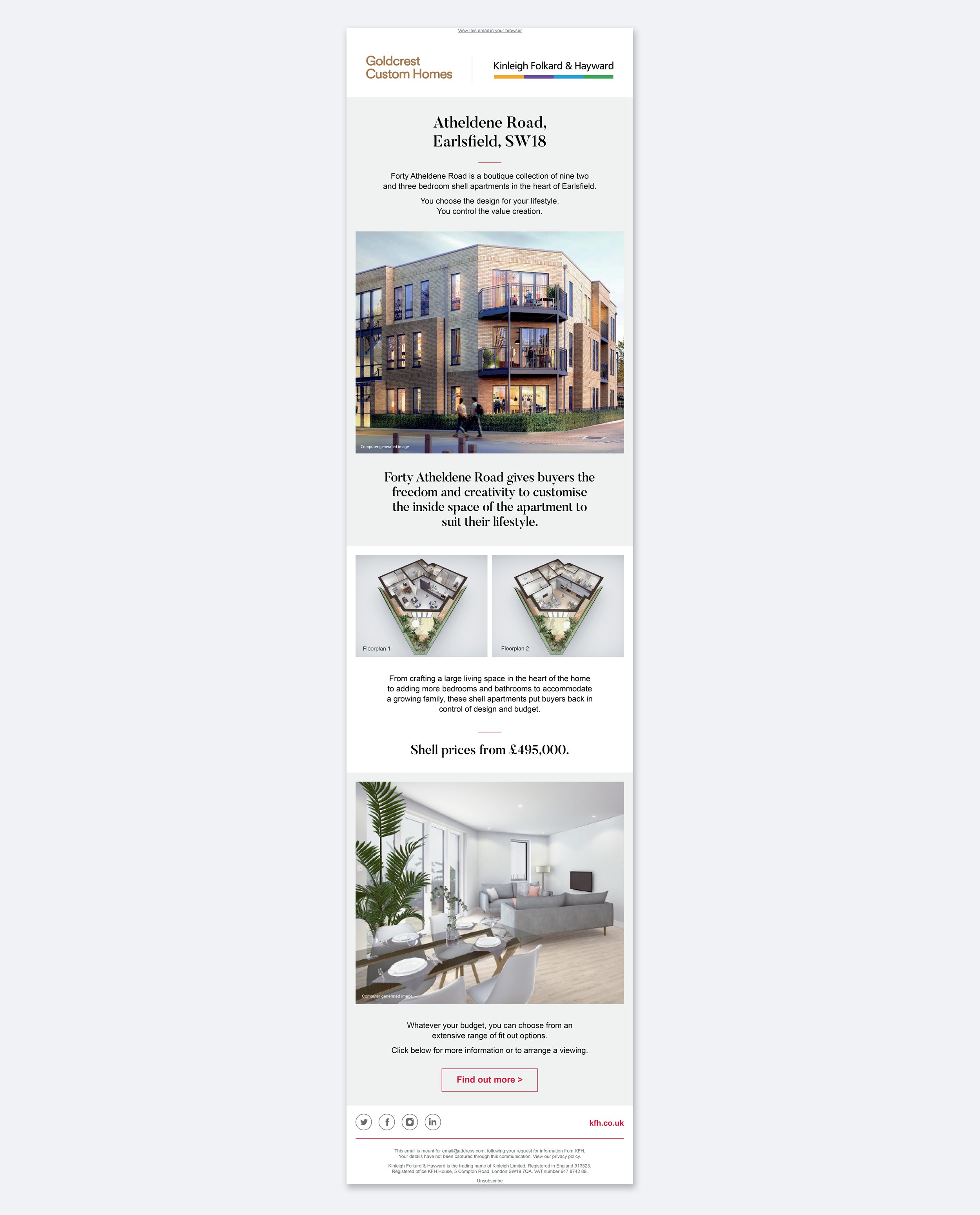
Land and New Homes: Atheldene Road
Concept design for the Land and New Homes Atheldene Road development. The email marketing was developed with a more sophisticated approach for digital. The KFH red was used as an accent colour, with black, light grey and white as the features. This was a major shift away from the print design and showed a progression of the brand.


